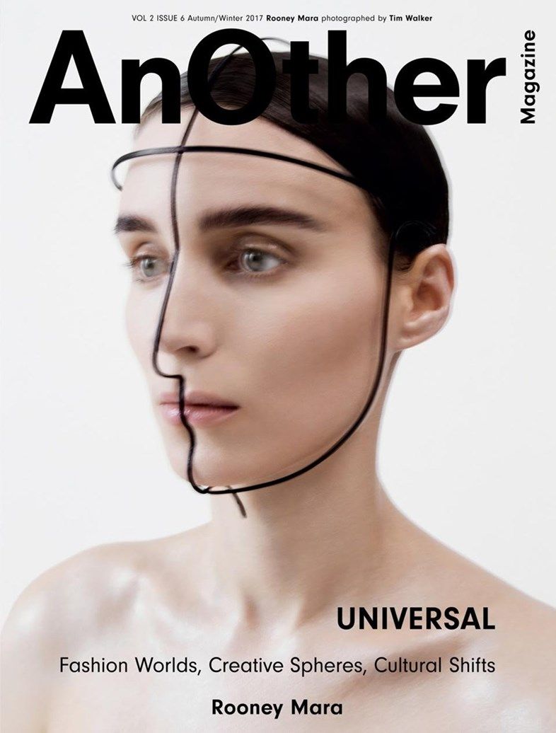
The image takes up majority of the background and consists of androgynous looking model, facing slightly to the left with minimal makeup, slicked back hair and very simple black wire mask over face.
the mask fits the shape of the face and is the most intresting aspect of the image.
Image itself is slightly blurred, cretaing the illustion of the mode fading into the white background.
The colour scheme of the front cover is mainly black, brown and white meaning the lettering and the models facial features come off the age in quite a harsh way.
The high key lighting gives the impression that the image was shot in a studio however with no detailing of the models name or an article linking to the image the audince are left with a lot of mystery.
Personaly the mise-en-scene reminds me of a ghost withe the faded background and the frail and pale man/woman.
Mode of adress feels quite quiet as the text is small and less shouty than thte titel.
the triplet of phases give the reader a very little bit of insight into what is going to be inside but do add some anchorage for the very monochrome image. The words hint at a new age the the image looks very modern so could be insiuting futuristic trends.
This could also add elements of narrative for the reader to explore by redaing on.
I think their primary audince is older fashion orinated people, maleor female not specfific. the fact there s no clear price insiuates that the magazine is expeince an does not contain childish content.
We can also assume that poeple are willing to spend more money not evening know what the magaine acully contains as it does not seem to need to specify for its audince.
STUDENT MADE
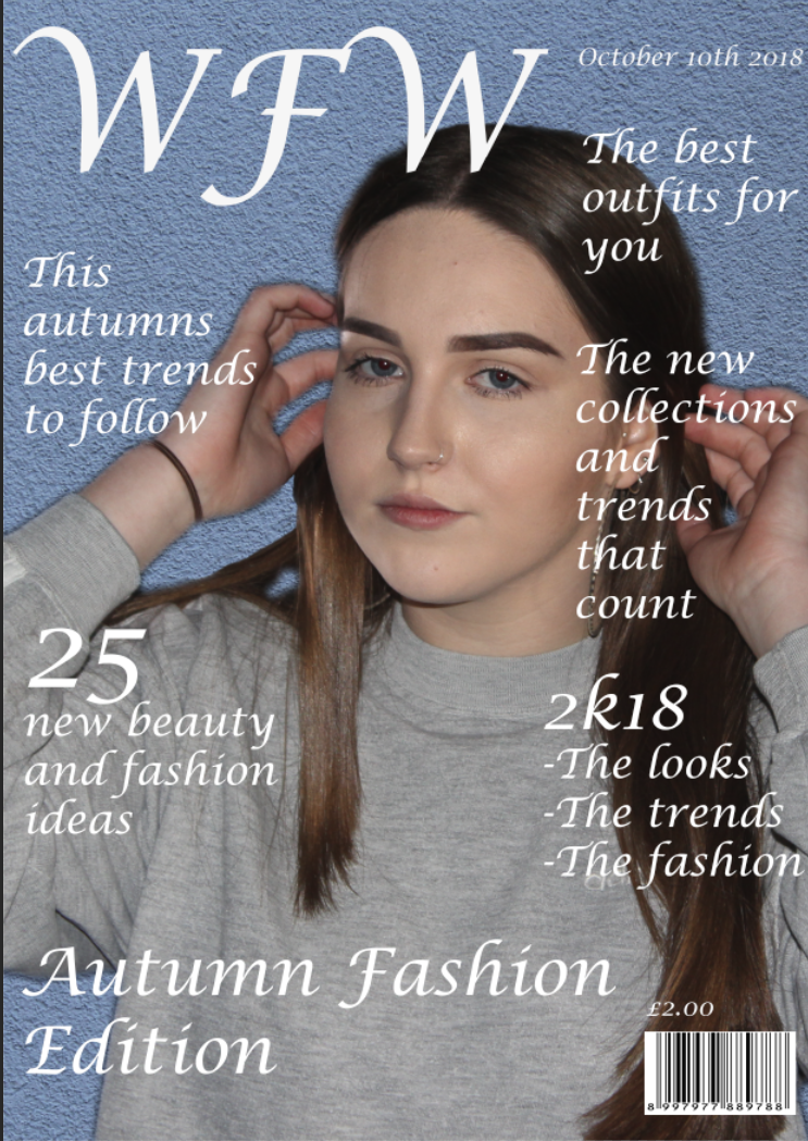
Layout is very similar to prevoius magazine with the a portrateof model taking upmajority of background, mast head in top left with subheading belwo and around as too not obscure the model.
In this magaize the bar code and price are visible at the bottom right.
All text is is white so as too stand out aginst the paste blue background and is in the more slanted facy font to look femiene.
There is a mixture of font sizes with he mast head being the lagest. It is also an acronym making the title not immedity obvious and ambiguous, the reader wil instantly be guessing what the letters 'WFW' stand for.
The image of the female model is simpleand attrective, her pose of havin her hands up as if just brushig her hair behind her ears is natural and girly.
her long hair is down over her shoulders and she wears a moderate but natrual amount of makup giving a girl next door impression an someone the female reader can relate too.
She wears a plaingrey blue sweat shirt wich blends in with the back ground making her face stand out more. This is a simlar effect to the prevoius magazine.
personally i do not like the rough photoshop job done s it is obvoius that the image has been pasted on a coloured background, i think it hould have just been taken in a studio if the producer wanted that classic plain style.
The picture is however anchored with ethe subheadings floating around it.
The quick catchy phases speaking directly out to the audince 'best outfit for you' combined with ethe direct adress of the model looking forward feels as if she is speaking out the the women reading the front.
Also her non imtimdating expression and simple outfit might entice the reader as she is not seen as a unachiable super model fret but more of a friend.
The use of numbers '25 new beauty and fashion ideas' makes it easy to see before you even open the magazine who it is aimed at and what it will contain.
Triplets are also used to add that catchy elenmt adding emepshis to content.
'the looks, the trends, the fashion' basically is saying the same thing three times on the other hand it adds weight to the idea of discovering yur unique look and makes the reader excited to read on.
I belive there primary audince is young owmna age range between 14-25 and their secondary audince being mums buying for daughters.